Enhancing the daily habit of meditation
Overview
Smiling Mind is an Australian not-for-profit with a vision to help every mind thrive. Their website and app helps those beginning their mindfulness journey with guided meditations and education programs.
Their meditations are suited to both adults and children, with content written and endorsed by Australian psychologists. It is an excellent starting point for people who want to bring a little more ‘calm’ to their day.
Project scope
Problem to be solved
This project was undertaken as part of the Harness Project UX Intensive course. Smiling Mind approached us as they were looking to get to know those who had progressed beyond being a beginner and may be considered more advanced meditators.
It was important to Smiling Mind to see how we could improve engagement with this user segment. For this project, I researched and designed a feature to improve the Smiling Mind app experience firstly by defining advanced users, and then determining their needs within the app.
My role
I collaborated with a team of designers on the research phase of this project, and individually designed a feature addition to the Smiling Mind app. This was then presented to the Head of Product for review.
Timeline
Start to finish: 9 weeks; a project-based learning experience via Harness Projects.
Tools
Adobe XD, InVision Studio
My process
A user-centred approach to understanding regular meditators
This project was guided by a User-Centred Design approach to understand exactly what makes advanced meditators tick and to start distilling what they may be looking for in an app.
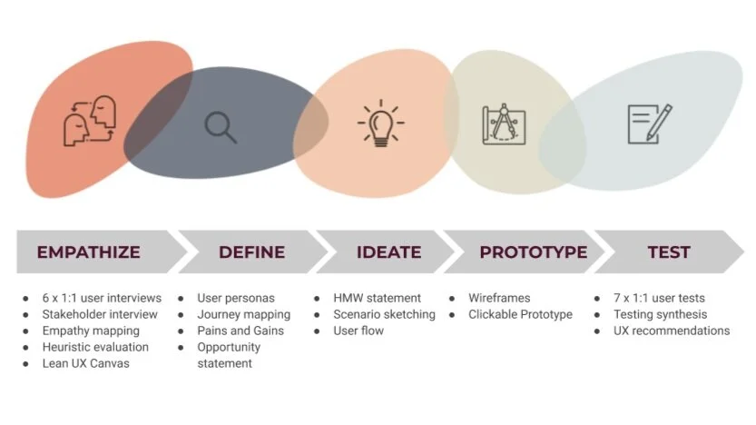
This process moves through 5 key steps:
Empathise with the advanced meditators, and understanding how they interact with Smiling Mind
Define and hone in on their needs through mapping their app journey, creating personas and defining the design opportunity
Ideate by creating a broad range of ideas for how this could be solved
Prototype the ideas that answer the advanced meditators needs
Test these designs with as many people as possible, and refine or pivot the design where required.
2. Empathise with our users
I planned and conducted six 1:1 interviews with advanced users using Zoom. I really enjoyed this phase of getting to know people and their meditation practise - it was an honour to hear how they care for their wellbeing in this way.
I gained some beautiful insights from meditators on how their practice enhanced their wellbeing.
“I know that when I do have consistency with meditating, something shifts in me - this kind of contentedness. I guess for me, that’s definitely the win.”
“You can’t learn anything about yourself until you stop thinking about all the external things. Who are you when you take away all these expectations - when we strip all of that away, who’s left? That is meditation. Becoming who you are without your thoughts and your doubts and your worries.”
“Anytime you can be present and in the moment with what you’re doing, it brings those moments of peace where you’re not looking for distractions.”
3. Define their journey
I then got busy with the post-it notes to group ideas and themes from speaking to meditators. I brought these research insights together with an empathy map to understand the opportunity for Smiling Mind.
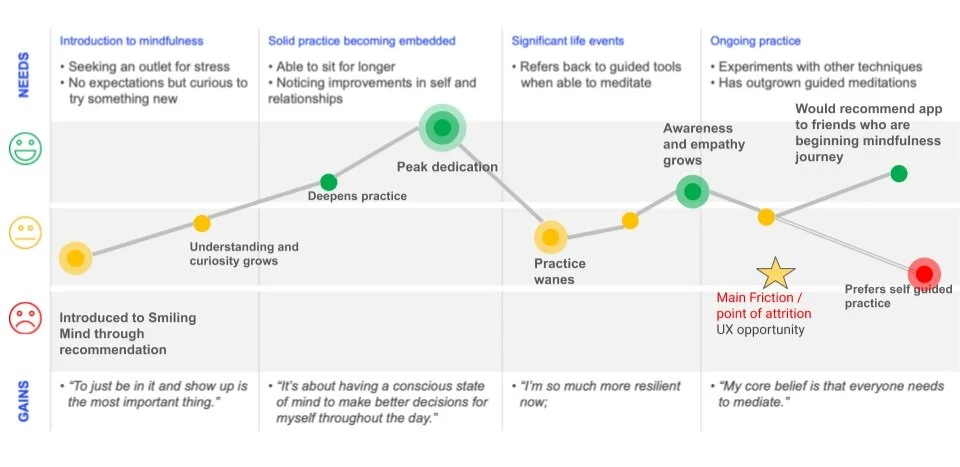
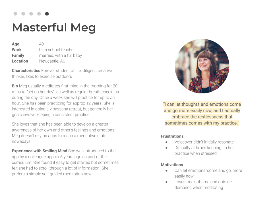
I identified the common habits of advanced meditators by creating a Journey Map and User Personas.
The advanced meditator journey map identified my UX opportunity
4. Create personas
From here, I could define that advanced users:
Had progressed beyond using an app
Needed more stimulating programs
Would use an app in moments of crisis
Needed flexibility in the way they practice
It was time to create a list of ‘How Might We..?’ statements to explore how I might answer this call. I pondered…..
🤔 🤔 🤔
“How might we allow advanced users to select a timer for an unguided meditation?”
I defined the Customer Value Proposition as this little pearl of wisdom:
“In a market defined by an abundance of choice in meditation apps, only Smiling Mind can offer a robust, clearly navigable app to engage and retain advanced users.
This can be achieved with the additions of a timer feature, to support advanced users to quickly access a session suited to their needs.”
💥
So, now we have our target audience locked and loaded - it was time to design something ‘spesh for them!
5. Ideate and sketch
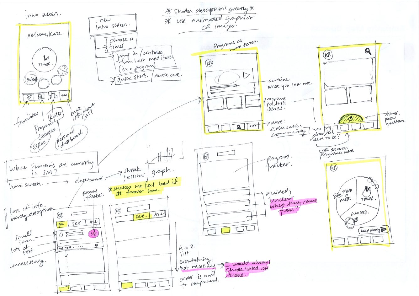
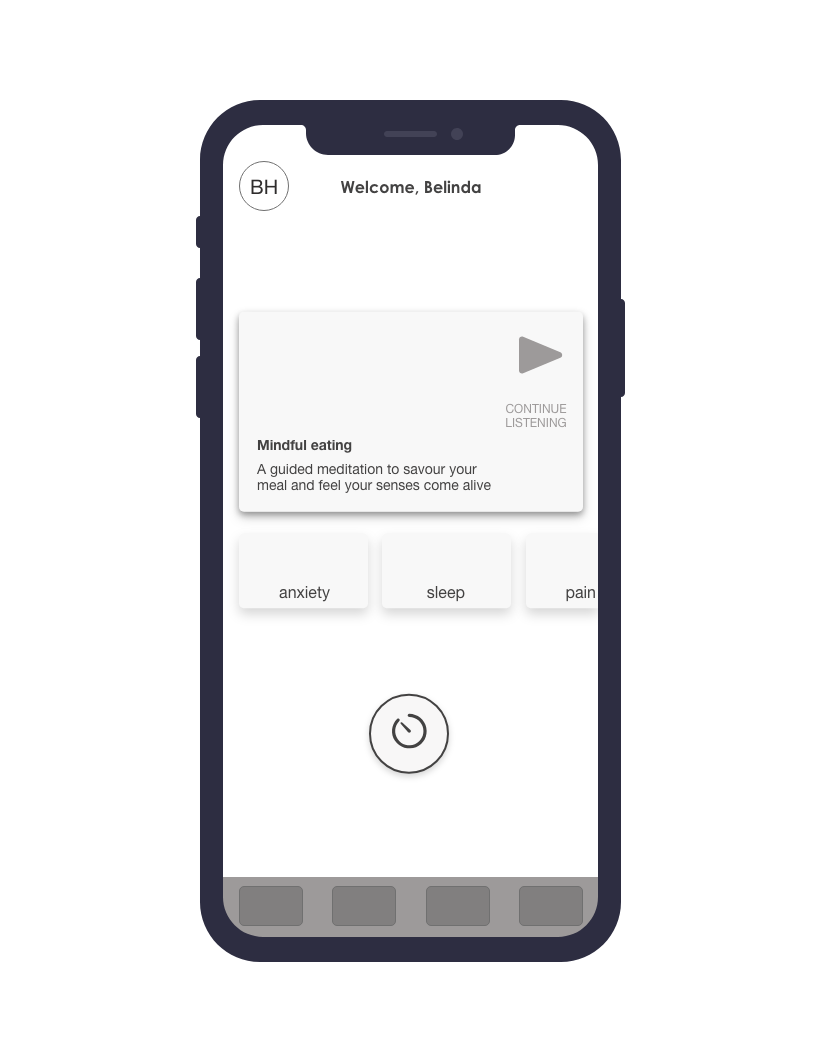
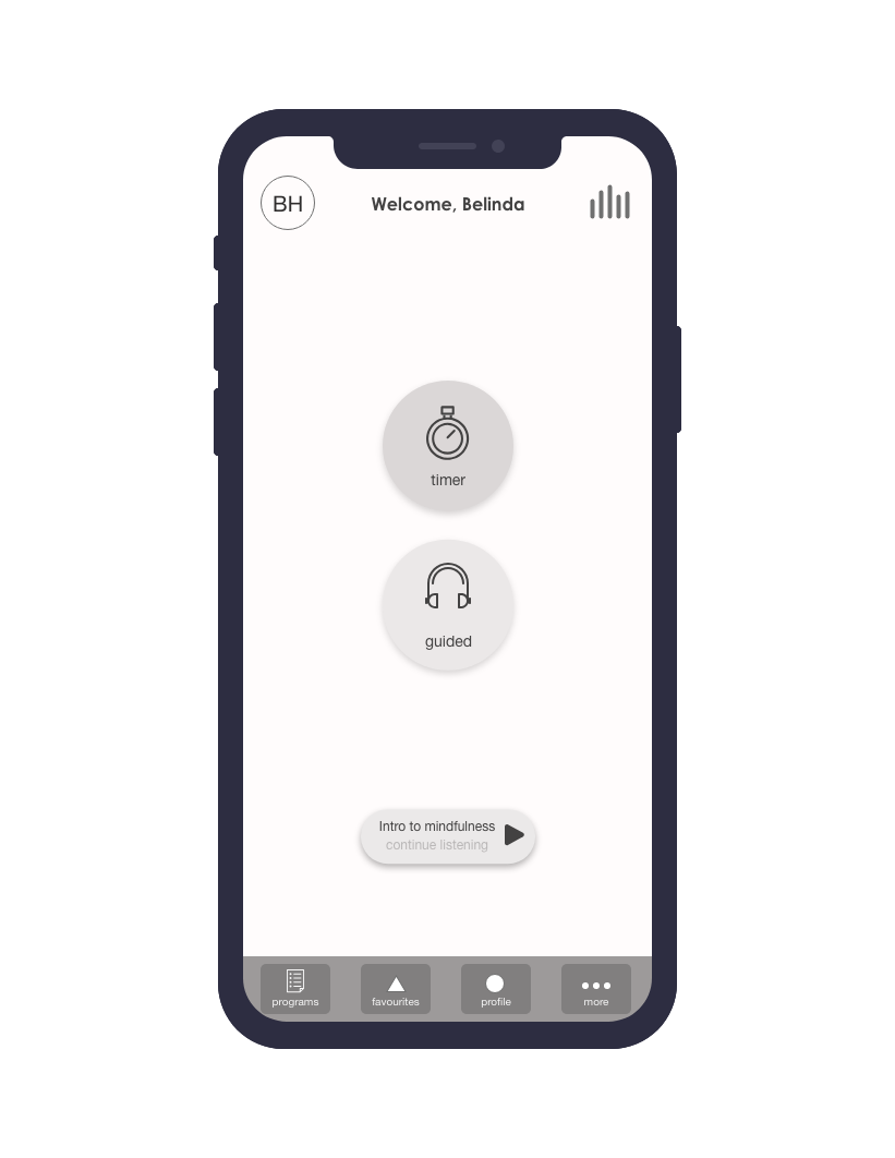
Now comes the fun part! …..sketching and throwing as many ideas as possible on the page for how to serve the advanced meditators. I sketched what a new feature might look like, how it might fit in with the current app, and a few basic user flows.
6. Prototype and test a simple wireframe
I then conducted user testing of prototypes with seven participants to gain feedback and validate the design.
There were four concepts tested to show my guinea pigs, I mean test participants, how they would access a timer and step through selecting their preferences.
During testing, two concepts were quickly put to the side and I moved on to refining the final design.
7. Finalize design
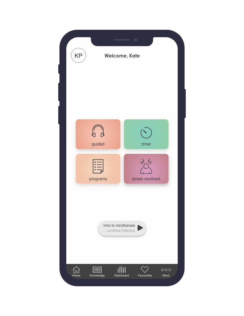
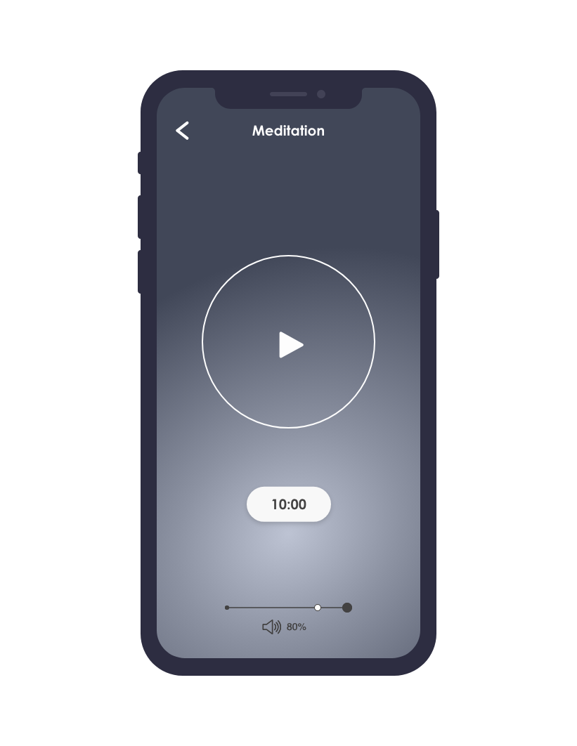
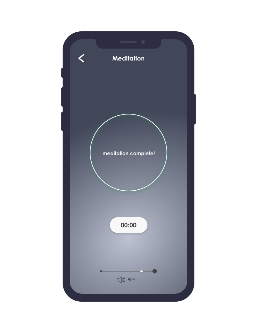
Finally, I created a clickable prototype for advanced users to quickly access a timed session suited to their needs. The feedback from initial research was that advanced users didn’t need as much audio guidance with their practice, and a timer would suit their needs.
The final design and UX guidance (on what to Stop - Start - Continue) was pitched to Smiling Mind’s Head of Product (this was fun!). A selection of screens are shown above.
Stop
Lengthy descriptions of guided meditation names
Small text
Doubling up of ‘My Programs’ and ‘My Sessions’ groupings
Listing beginner content for advanced users on sign in
Start
Adding a timer function from the home screen
Additional voice option, especially for users in an acute situational need, may need something more ‘gentle’
Simplifying the first screen viewed, add home button.
More high contrast colour choices (especially with text)
Continue
Psychologist backed content (robust and trustworthy)
Meeting beginner meditators needs
Variety of programs
Outcome and learnings
I thoroughly enjoyed the research and interview phase of this project and the opportunity to hear people’s stories. It was both fascinating and a privilege to hear how people tend to their well-being through meditation.
Undertaking a project in the area of mental health and wellbeing, I became aware of the need for designing for accessibility for this user group, such as using a calming, clean UI and intentional colour choices.
I also learnt not to assume (!) that things that seem obvious to me may easily be overlooked by those viewing at the design with fresh eyes. When observing people using my mockups, the position of the timer button was overlooked by many of the testers in the first layout. This quickly got me into the habit of testing for quantity - lots of fast, simple iterations - over quality - of a polished UI design.


