Creating an engaging sign-up experience
Overview
Coassemble is an online training platform that makes it easy to create engaging courses. The company itself was shifting from a traditional Sales-led business, towards a more scalable product-led model. This was an exciting phase and meant a lot of juicy UX projects.
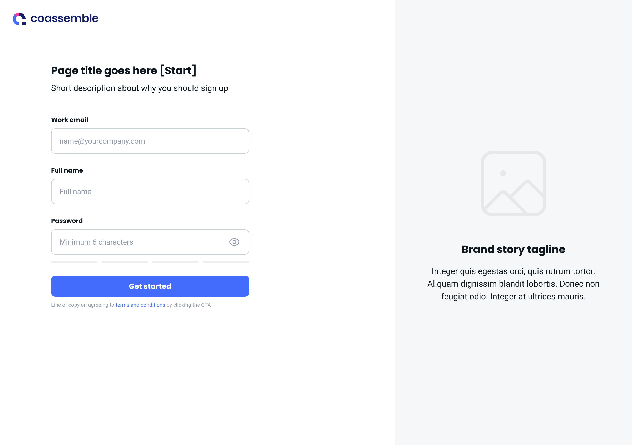
A customer’s first interaction with Coasemble was the sign-up flow they encountered while accessing a 7-day free trial.
The existing sign-up flow - while functional - didn’t showcase the product, was slow to load, and didn’t allow us to understand our customers beyond the basic details they provided. We had an opportunity to build a clear data-driven picture of our most successful customers.
We wanted to increase the conversion rate of the sign-up flow, while taking the opportunity to understand our customers more deeply.
This project involved redesigning the sign-up flow to solve these problems:
find out key info about leads to validate our marketing personas - were we on track with who we thought our target market were?
improve slow load times in account creation that was adding to drop-off
be more engaging and introduce our company’s brand straight away
Project scope
Audience
Everyone who signed up for a free trial of the product went through this updated flow to create a new account.
My role and responsibilities
As UX designer, I was responsible for collaborating with the Marketing and Sales teams to identify the data we wanted to glean from our customers. This informed the design decisions I made to create wireframes and prototypes for the UI team to polish.
Project timeline
The timeframe for the redesign was:
Research and info gathering - 2 weeks
Wireframe and UX design - 2 weeks
UI design - 2 weeks
Development, testing, implementation and tracking - 3 weeks.
For the delivery of design, I worked with Sam Blomley, UI Designer, and Jonathan Pass, Senior FE Engineer.
Tools used
Figjam, Figma, Mixpanel
Problem Statement
We wanted to better understand who our users were, in order to improve their free trial experience once they were in the product.
By asking key demographic and use case questions, we could:
begin to truly quantify our target audience
understand the traits that led to success with our product, and importantly -
surface this information to the Sales team so their reach-outs were more meaningful, leading to a positive business impact
My process
1. A deep dive into existing data and competitor sign-up experiences
I began by talking to stakeholders in the Marketing and Sales teams to understand the key points of info we wanted to learn about customers. These became known as ‘the questions we would ask’ when users signed up for an account. It also became clear that while our Sales and Support teams had fantastic knowledge of our customers, it was hard for the wider team to access this info. We needed a unified, data-driven picture.
Alongside that, I dived into extensive competitor research to get ideas for how we could ask these sign-up questions and make it fun.
🥳 🥳 🥳
I wanted to understand the balance between asking lots of question in the sign-up flow, therefore gaining lots of info on leads, and; asking too many questions leading to a decrease in conversion through the flow.
I then prioritised our options via a decision-making framework to consider tradeoffs of time, complexity and business impact.
Research deep dive on competitor sign up flows
2. Refine the info we want to gather
From here, I could distil these options into three categories of questions.
Personal info - functional elements required to create an account
Workspace setup - giving your workspace a name
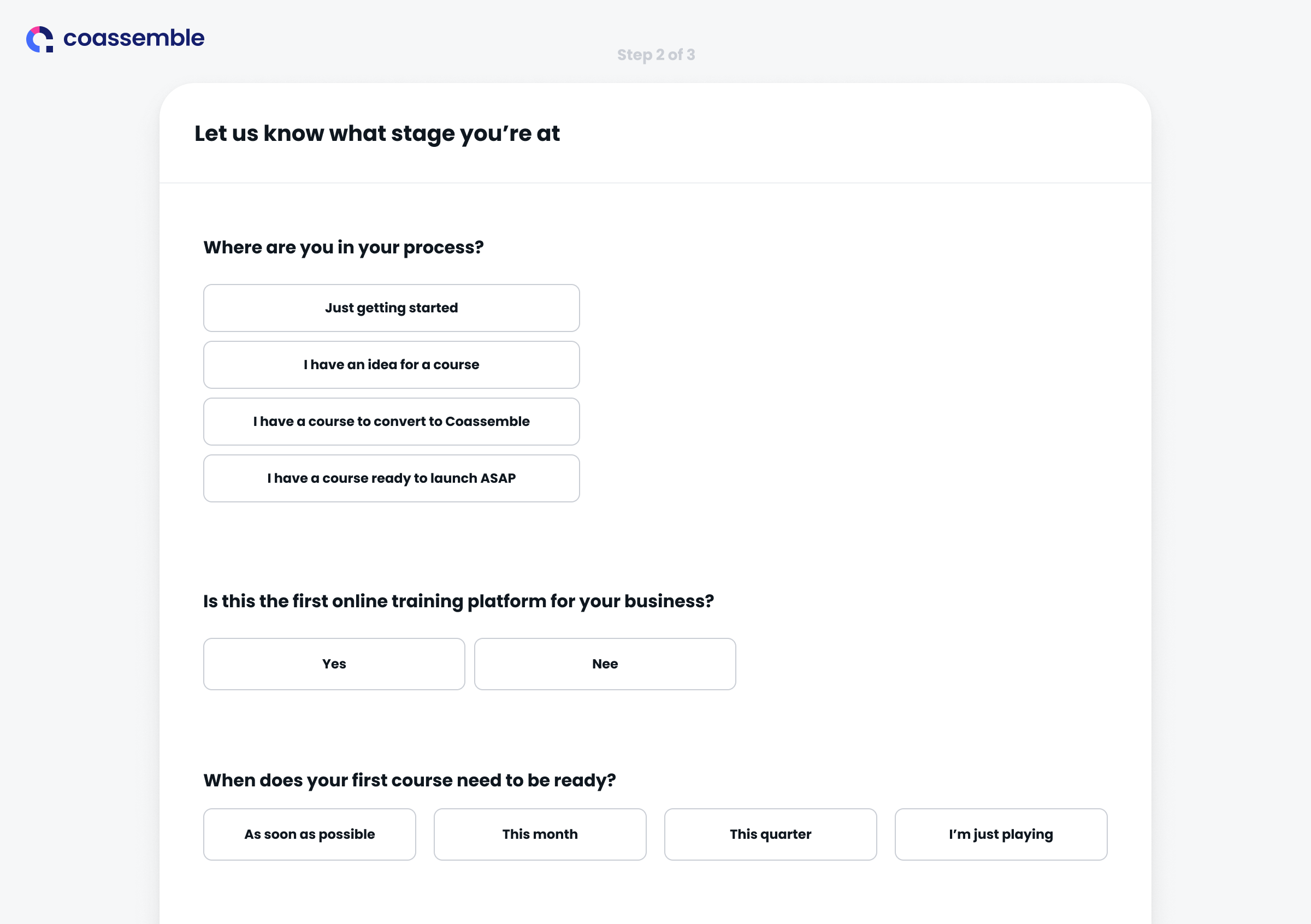
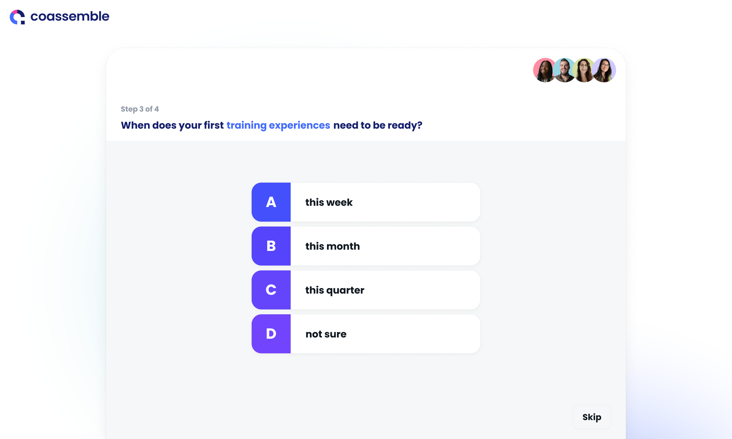
Use case details - the juicy part; where we could understand what their hopes and dreams (!) are for their online training. Yes, it can be that exciting..!
This refinement included evidence of why each step was important and what we wanted to learn from the user.
3. Experiment and fail (mostly) fast
As an initial compromise to taking the time to build a native sign-up flow, we experimented with third-party tools overlayed onto the end of our account creation process. You could call this a bunch of ‘hacky tests’. The idea was great - fast, simple, and iterative, yet in practice we still experienced lag in account creation and some hiccups with data flowing through properly. I realised we also weren’t solving one of the key problems, which was to build brand awareness.
This proved be to the long way around, so we pivoted back to a native sign-up flow build.
4. Create wireframes for testing
Once I had the building blocks established (‘the questions’), I created basic wireframes to start getting feedback from the team


5. Design a detailed prototype
I iterated on the design to create a more detailed prototype for feedback and handover to the UI designer, including specific design details for our UI designer.
At this point I started incorporating elements of the existing product, to showcase Coassemble and give users a taste of what we’re about - our brand story. This was the fun part!


5. Team testing before rollout
Once the sign up flow had been developed, as a team we tested the new flow before release and made sure all tracking was functioning correctly in Segment and Mixpanel.
Outcomes and learnings
Overall, we maintained a consistent conversion rate throughout the process, even after adding five extra lead scoring questions. This provided us with the significant advantage of a data-rich profile of our target persona and the ability to personalise their first experience in our product.
The simple, component-driven design meant we were able to easily add and adjust questions asked, as required. This had a minimal impact - updates were completed and released by the dev team in a day.
One of the biggest wins from this project, outside of the visual update, was that we now have consistent data flowing into Segment and Mixpanel, which can populate lead info quickly and clearly. We can use this to identify the traits of our more successful leads, and ultimately aim to attract more of them!
The engineering team helped us identify a few key steps of the process that were slowing down account creation times - I would delve deeper into this sooner next time, for a net improvement in the user’s experience, even if it feels like it momentarily slows down the project for extra dev changes.

