
Updating the course creation experience
Overview
When I joined Coassemble in 2020, the course builder was a little clunky and form-based, and each screen required a new page load. It was tricky to navigate through, and this part of the app had many layers to get your head around!
This project involved redesigning the course builder part of the app to be a ‘single page’ experience.
Project scope
Audience
This update was rolled out to all new and existing users of the platform. The subjects of the user testing were existing customers.
My role and responsibilities
My role as UX designer was to:
undertake initial research to understand the problems with the current design that our customers were facing
synthesise research findings
create an updated UX design for the course builder
recruit and undertake user testing before the development phase
Project timeline
As this was a major overhaul of the app, this work was completed in a 3 month block alongside a UI Designer and Senior FE Engineer.
Tools used
Sketching, Miro, Figma
Problem statement
We wanted to better understand how users interacted with the improved course builder experience in order to refine our prototypes before release
The aim was to simplify the user experience of building a course within Coassemble to be clearer to navigate, faster and more intuitive.
Process
Initial research with stakeholders
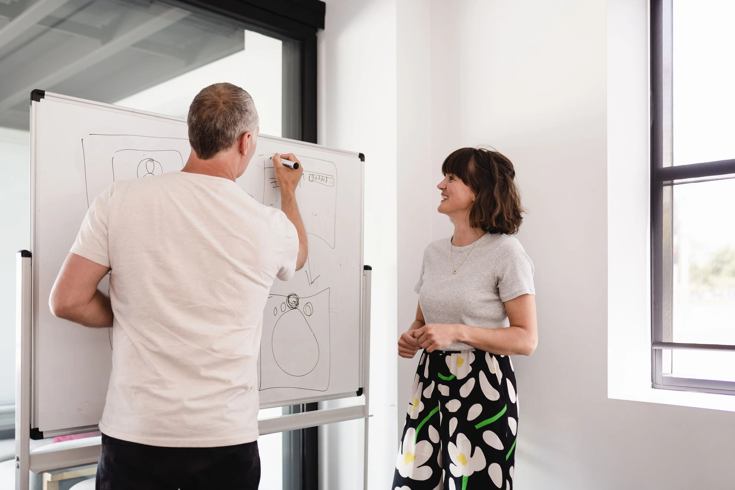
I started by talking to 3 of our wonderful Customer Success team members - who are literally chatting to our customers every day helping them trouble shoot problems, and offering up best practises for their training.
This was en excellent way to hear first hand what the problems were to be solved.
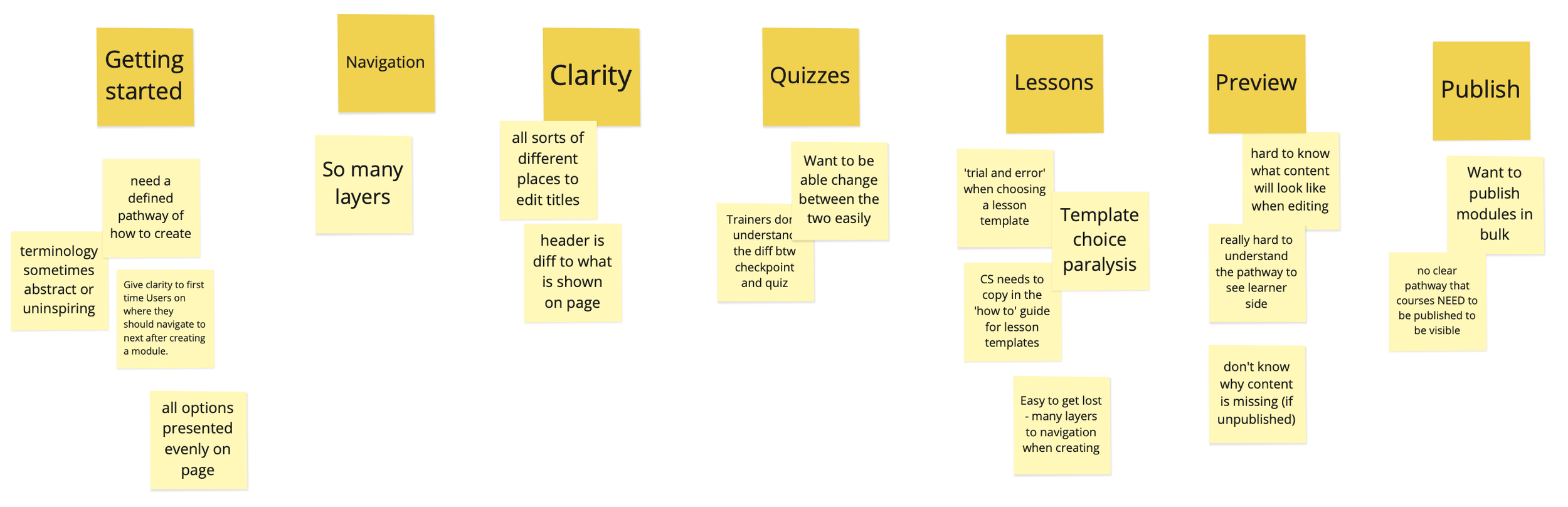
2. Refine and clarify
I then synthesised this customer feedback and then info from my colleagues into key areas that required some design love:
3. Ideate - put pen to paper!
From here it was of course time to pull out the trusty sketch pad and throw round some ideas, before I dove into Figma for some wireframing…
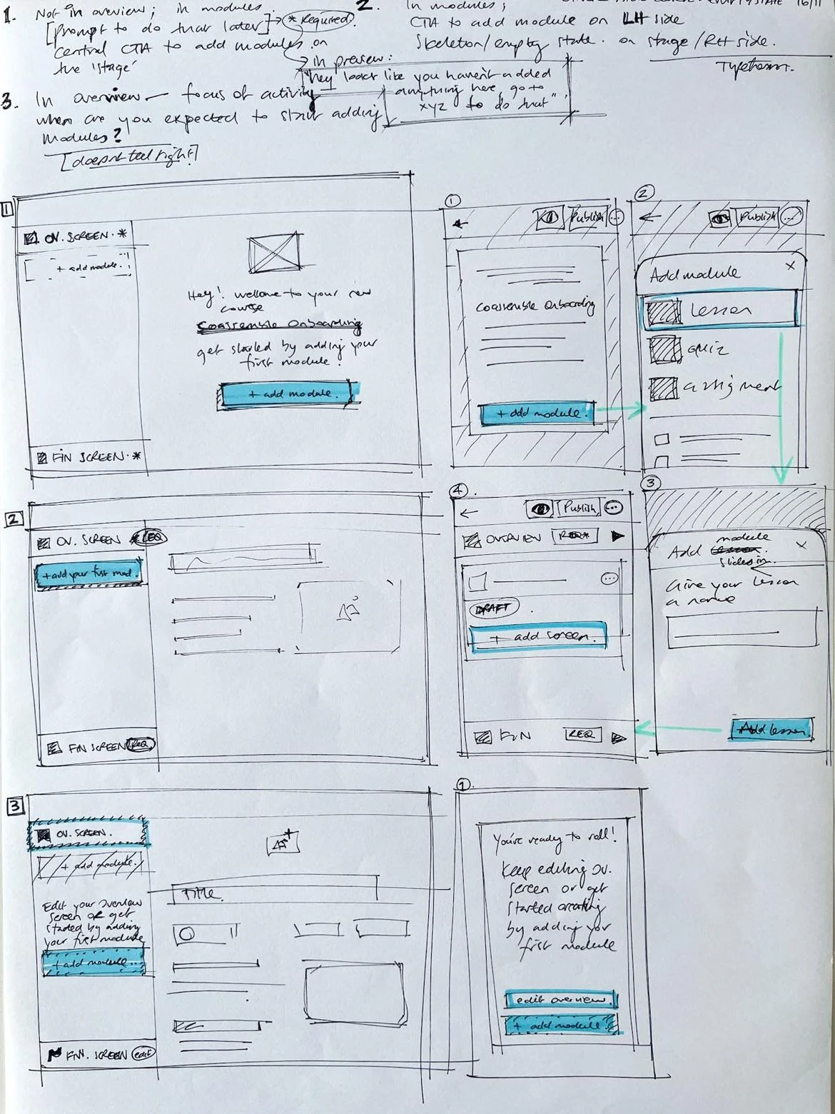
Initial ideas for course builder redesign
4. User testing with customers
Before the design was finalised by the UI team for development, I wanted to get our prototype in front of some of our established customers for testing. This involved:
I recruited a list of ~50 interested customers who said they were willing to participate in user testing
this was simply a line at the bottom of email that was sent a few months before release, letting our customers know big updates were coming. “Please reply to this email if you might be interested in testing out our new design!”
Confirmed 5x customers who could commit to a 30min zoom session, scheduling across multiple time zones 🌎
these testers were a mixture of customers who had been using the products for <2 months, to 2+ years
I created a lightweight prototype for testing, that wasn’t too detailed that it would slow down the experience (a consideration for unpredictable internet connections!)
established four scenarios for testers to run through, to observe their interactions with the prototype and the ease of use.
each scenario was backed by a hypotheses about what we were testing, and when we would know that the mission was ‘complete’
After each call, I sent out a brief survey to gain any additional insights, or perhaps feedback testers didn’t feel comfortable sharing at the time.
Outcomes and learnings
This update had minimal impact on existing users, and we received lots of positive feedback. Our customers were happy that “the left nav bar is really useful while editing and being more consistent with the learner view will mean less need for previewing while editing” - post-interview survey.
I learnt quickly that the setup and recruitment phase of user testing took much longer than I anticipated, especially when coordinating across US and EU timezones. A few early mornings!
Next time I would do a few quick usability tests with Maze or Lyssna, before talking to customers, to maximize my time with them
I thoroughly enjoyed talking to our customers and hearing first-hand of their experience with the app. It was a great way to build relationships with a few of them who were more than happy to assist with future testing sessions!